Topics in Photographic Preservation 1991, Volume 4, Article 4 (pp. 34-56)
A presentation to the AIC Photographic Materials Group February 22, 1991
I'm delighted to be with you this morning and to have the chance to share with the PMG the progress of our new building. In nearly ten years on this project, I've celebrated a few milestones. This morning's presentation is one of them, since it's the first time that people hearing about the building will be able to see some construction on the site. At CMCP, we are nothing if not tenacious.
Over the past decade, my colleagues and I have watched with envy announcements of new museums and expansions proceeding from ground-breakings to dedication. Museum construction is clearly a growth industry: I heard recently that one museum opens every week in France; one every day worldwide; in Canada, we are certainly contributing to those numbers, at least by announcements.
In the field of photography, new or expanded photographic museums have opened in Riverside, California; Tucson, Arizona; Rochester, New York; San Francisco and New York City; in Canada, artist-run centres have created new spaces for photography in Toronto, Winnipeg and Saskatoon; photography has been accorded dedicated galleries in major institutions like the Musee d'Orsay, the L.A. County Museum and the National Gallery of Canada; the Canadian Centre for Architecture in Montreal has opened a splendid new building where it can begin to display its photographic holdings. I could name more but I'm distracted by the words that I see floating over your heads. You seem to be wondering: What the hell has she been doing all this time?
Before I pull out the plans and the site photos, I should give you a bit of institutional history since the development of any construction project is so inextricably linked with the history and culture of the client institution.
The Canadian Museum of Contemporary Photography is a five-year old institution with a fifty-year history. It was created in 1985 by the transfer to the National Gallery of the collection, mandate and personnel of the Still Photography Division of the National Film Board of Canada. The Still Photography Division had been part of the NFB since its foundation in 1939, evolving from a service and information branch to the federal custodian of contemporary Canadian photography. As such, it had accumulated a collection of approximately 156,000 images and developed museum-type programmes of exhibitions and publications.
In 1984, the National Film and Video Policy declared the Still Photography Division to be “extraneous” to the NFB mandate. A plan was devised to transfer the collection and personnel to a central library serving three national museums: the Museum of Man, the Museum of Natural Science and the Museum of Science and Technology. This was firmly rejected by the photographic community which lobbied for the creation of a distinct photographic museum. In December 1984, the Minister of Communications Marcel Masse announced the creation of CMCP as an affiliate of the National Gallery of Canada. Under this arrangement, the integrity of the Division's collection and programming was to be maintained. Also perpetuated was the mandate of the institution as a custodian of art as well as documentary photography.
This dual function had resulted in a large and varied collection of transparencies, negatives, prints and photo-based works including sculpture, installation and video. Numerically, the collection is dominated by commissioned transparencies and negatives, some 100,000 from assignments that were given to photographers between 1962 and 1970. Previous assignments are housed in the photographic collection of the National Archives.
The development of a print collection began in the late sixties corresponding to the general increase in activity that spiked internationally with the boom of the early seventies. It is interesting to consider that, for twenty years, the Still Photography Division acquired all the work from its exhibitions, with circulation and promotion of the medium uppermost in people's minds. The result, however, is a collection that is a partial history of Canadian photography and a complete history of contemporary Canadian photography's most active institution. The CMCP exists among other federal collections that deal with contemporary Canadian photography: the Art Bank of the Canada Council, the National Archives and the National Gallery in its departments of Contemporary Art and Photography. The museum continues to acquire contemporary Canadian work in its two areas of concentration: social documentary and photographic works of art. Works from the collection are circulated across Canada and abroad through a programme which will continue and, hopefully, even expand internationally, after the museum opens its new facility in 1992. At the moment, we are a museum without walls but this was not always so.
The Still Photography Division operated a gallery in Ottawa from 1967 to 1983 when the space was closed in anticipation of a move to new quarters. This was the first building project, one very different in character and scope from the one we are working on today. Its brief history follows.
In 1981, as the new Executive Producer of the Still Photography Division, I was assigned the problem of finding new accommodation for the Photo Gallery, the collection, the offices, studios and workshops. Previously, the collection and offices had been in a government records warehouse in the west end of the city while the NFB Photo Gallery, under the watchful eye of a part-time attendant, had been hidden off the lobby of a slightly better office building four miles away on the edge of the downtown core. No one went there; it was the best kept secret in Ottawa. Furthermore, operationally it was impossible to have the gallery and the small staff so far apart: my assignment, eagerly accepted, was to develop a small, well integrated facility in a much better location.
I was very naive; I just drove around downtown and when I saw something interesting, I called up the owner and made inquiries. I called, for example, the American embassy because they didn't seem to be using a small building adjacent to their property. I asked people who came to the NFB gallery. I opened the government phone book and called people in charge of federal real estate. After many calls and letters, a senior person at Public Works told me quietly about a building in the Byward Market area: a dilapidated brick warehouse that had been advertised in the paper in a tender call for development proposals. The building actually belonged to an affiliate agency of government, the National Capital Commission. I called around and finally tracked down the government person in charge. He put me on to the successful bidder, an architectural firm that seemed very interested in incorporating the Still Photography Division into its plans. The architect/developers told me the size of the building and how it could be expanded a bit to hold our entire operation. We developed some floor plans and elevations, all very schematic and based on our current facilities which the architects came once or twice to visit. We explained about the conditions under which we wanted to exhibit and store the collection; the developers agreed to meet them. We got approval for the project from the National Film Board executive and Board of Trustees; the NFB got central agency approval to sign the lease. By that time, eighteen months had elapsed. It was December 1983. I had a roll of plans and a stack of approvals. An announcement was imminent. It was then that the whole project was cancelled because of the impending transfer of the Division to the National Museums.
When we regained consciousness, it was January 1985. We were no longer a photographic division of the NFB but a museum; CMCP had been promised a new building, and we were starting the whole search process over. This time, however, the process was completely different. Informed by museology, and bemused by bureaucracy, it crystallized into infinite more detail.
Planning for the first project had been a simple projection of what we knew onto a predetermined site. With some room for expansion in the collection storage area and greater flexibility in the galleries, we had been satisfied by an overlay of the existent facilities on the proposed one. This had also served as a useful argument for the project: that we were not expanding our territory but rationalizing it. There were solid precedents to be cited for better storage and fire protection of the collection; there were economies in having the entire operation under one roof. The conceptualization of the first project was a literal translation of our institutional needs. The diagnostic process was streamlined and efficient; in organizational terms, it was top-down, with little time or opportunity for staff to express their uneasiness with the status quo. Essentially, the design for the building had flowed from a very conservative principle: if it ain't broke, don't fix it.
Planning for the second project was completely different. It began with a period of discovery and analysis conducted by a team of architects and facilities managers, then under the umbrella of the National Museums of Canada. They directed a study which would lead ultimately an architectural programme: an exhaustive description of CMCP's needs examined from all points of view - quantitative, functional, technical, qualitative and locational. As the author of our architectural programme, Michael Lundholm, has recently put it, the document has two purposes: the first being “the definition of the design problem;” the second, “guidance for the critical analysis of design proposals.” I would add less elegantly that the architectural programme also arms the client against well intentioned and hare-brained ideas that don't stop coming once people get wind of a building project.
When preparing an architectural programme, the writing of qualitative and locational criteria sets the tone for the whole exercise. The architectural programme is highly specific in some areas - technical and functional, for example - but locational and qualitative criteria are meant to profile the ideal building. Institutions developing a plan for a specific site or contemplating an expansion might be tempted to skip that part of the narrative but I would caution against it. Describing the ideal site helps the client who has ultimately to deal with the realities of a less-than-ideal site. Qualitative parameters protect the integrity of the project during the painful, often unavoidable, exercise of choices and cuts. With a written description of an ideal building, the client can better recognize the impact of difficult decisions that may be mitigated operationally. This is true of the whole programme as you'll gather from our experience.
The first step toward the CMCP architectural programme was an evaluation of existent facilities. They were pronounced inadequate - no surprise there - one wondered at the time why it was necessary to record the fact that the out-of-the-way industrial park in which we worked was unsuitable for a public gallery - one wondered in fact until the project stretched out over years and people forgot why we'd needed a building in the first place. At the time, however, the process was interesting but, by comparison with the previous organic approach, tedious and overcomplicated.
As leader of the client group, I was asked immediately for locational and qualitative descriptions: the first was no problem - I'd done all that driving around - but the second was a real challenge. I was encouraged to provide some models which made me uneasy because I had no model photographic museum in my mind. Analogies seemed equally dangerous in an architectural period of appropriation; I wanted the museum to express its own function, not some borrowed image. Then I remembered the advice that had been given a client contemplating a new home: write down everything you've always disliked about your house, said the architect. For them and for me, this was a lot easier than dictating my likes.
For example, I had never been comfortable with the conventional marriage of 19th-century and 20th-century photographic works with prints and drawings. Conservation requirements aside, it seemed to me that the correct spatial environment for prints and drawings did not necessarily apply to the more overtly technological photographic print. I felt that they should be treated differently.
Despite their flexibility and low-maintenance, I didn't want the ubiquitous texture of linen walls and carpets; I wanted cool spaces and hard surfaces - a McLuhanesque environment - and I wanted a place of energy and creation where things could be tried - a laboratory, not a salon.
I wanted the collection exhibited under the best possible conditions, but I also wanted the Museum to offer a sense of openness and welcome that conservation requirements sometimes discourage.
Finally, I wanted the Museum, the first photographic museum in Canada, to establish a unique architectural idiom. Nothing borrowed and no confusion of identities: “It should be obvious,” I wrote, “That the museum is not a greenhouse, not a day-care centre, not a church, not a shopping plaza, not a health spa” and “not a quasi-heritage construction of doubtful Bytownesque extraction.” I forgot to mention that it should not be a railroad tunnel, but I'm getting ahead of myself.
The qualitative anti-criteria were the sum total of my creative input to the programme. The real priority became the articulation of quantitative, technical and functional requirements.
Quantitative requirements were perhaps the easiest. There was, we thought, a fairly predictable growth pattern for the collection which came to the Museum largely through purchases from a budget of $150,000 per year. In 1984, one could anticipate between 400 and 500 prints per year. It was just at the point when prints became wall-sized and their prices blew up too. We can now acquire fewer works, which reduces our documentation costs, but the works are more expensive and storage is a huge problem. Expansion in the collection storage area was intended to be handled by the introduction of compact storage after about ten years. The programme called for a thicker concrete slab under the collection storage rooms. We are now considering the immediate installation of compact storage, a measure of how rapidly things have changed.
The size of the galleries was easy to determine because it flowed from an explicit part of the mission. The Museum was seen as a pied-a-terre for a national programme, a symbol and a safehouse for the collection. It was created to perpetuate the work of the Still Photography Division; as such, it was critical to the photographic community that we maintain our travelling exhibition programme at its high level of service. The national and local programming had to be kept in balance.
Other dimensions were derived from similar combinations of old and new factors: replacement of the status quo and corrective measures to bring the former Division up to current labour codes and museological standards.
Many of those standards were addressed in the technical specifications for the building. In terms of conservation, the status quo was instructive only as a point of departure. It was hard to measure good housekeeping and good intentions. The unframed works in the collection were kept in an environmentally-controlled room but under a sprinkler system. The framed works in the travelling exhibition programme were kept in their cases, piled high, under normal office conditions which in the crummy building that we inhabit are somewhat abnormal and erratic. The former gallery had no environmental controls except when the attendant grew too hot or too cold. These things had been duly noted in the evaluation and controls for light, temperature, humidity, contamination and physical damage were outlined in the specs.
[Unfortunately, at that time, as now, there was no conservator on staff. The Museum was not without advice from the National Archives, the Canadian Conservation Institute and the National Gallery. Within the National Museums, the future requirement for a conservator was a matter of approved policy but a working space for conservation would not be included in the programme.]
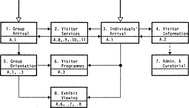
The last and most consuming study was the determination of functional relationships. This was a deceptively complex task. Relative to a multi-disciplinary museum, CMCP seemed so straightforward. The difficulty lay in the complexity of each individual's job. In most small museums, people wear several hats and this became a complicated matter to express on paper. Not all the operational processes of the museum were studied but only the main ones: public circulation; accessioning; exhibit production; travelling exhibition processing; publication production and audio-visual production. There was an intense period of interviews with staff that set the tone for the design review process that would follow. The operational diagrams looked like the following:
1. Public circulation describes the movement of visitors - both groups and individuals - through the facility. We determined that there were several types of visitors, not all there for the exhibits but many wanting access to the collection, the library, the facility, the curatorial, programme, production or administrative staff. The Still Photography Division had always been very open; suddenly, we were faced with new levels of security that were very difficult to accept, much less to implement.
2. Accessioning here describes the much larger task of receiving and reviewing portfolios proposed for the collection. Several of these arrive each week and this diagram expresses well the comings and goings, but not their frightening pitch. There was a coldness to this schematic rendering of ACCEPT/REJECT that I never wanted an artist to experience.
3. Exhibit production describes the mounting of an exhibition for in-house exhibition or travel. Some of these jobs might take place elsewhere but the inevitable process was one of accumulation: the artifact would grow and grow, with all the additions of matting, framing, labelling, crating, interpretation and promotion.
4. Travelling exhibition processing seemed incredibly labour-intensive when one considered the number of bookings: 80 to 100 outbound shows per year with each exhibition numbering between 25 and 155 works, each needing to cleaned and checked upon reentry.
Confronting these cyclical-tasks and considering their reaccommodation was almost overwhelming. The architects posed question after question. As the process ground on, we came to wonder how we did anything at all, even without a gallery, and it certainly seemed inconceivable to do more. This feeling, of course, soon passed and we were able to turn the tables eventually with hard questions during the review periods of the design.
5. The last diagram that I want to show you is the overall view of adjacency requirements. In a small organization, this, as I've said, is where you really get into trouble. Unlike large groups of specialized individuals, small organizations attract people who flourish with a variety of tasks that overarch and second each other in eccentric ways. Adjacencies could be worked out in abstraction but on a small institutional scale, old habits would probably prevail. And of course, this is where the fit of the institution, onto a site or into an existent building, really makes a difference. What is amusing here is how similar this abstraction was to our future building.
In 1986, when a site was identified for the Museum, it was, in fact, a long narrow space. It was a disused railroad tunnel, in a prime location in the capital, between the famous old railroad hotel, the Chateau Laurier, and the locks of the Rideau Canal. Here are a few views of the structure at that time. [slides] You can see the arched bays opening onto the canal. They were the main feature of the structure, not a tunnel at all, really, but covered passage beside the hotel and under the bridges into the old Union Station. One could also catch a trolley by going down stairs from the street. These photographs of the lock operations give you a sense of the length and narrowness of the space. The distance between public and private functions could not be more plainly expressed.
From this vantage point toward the Hotel, you can imagine a glass pavilion at street level and an entry sequence down two storeys past one of the most magnificent views in the city. Two views of the pavilion, and an early elevation drawing give you an idea of the exterior. [slides] The museum entrance is part of a complicated scheme to restore the terrace to the Hotel (itself dual purpose as entrance to the garage and terrace cafe). There is also a network of walkways providing a connection to the park and on to the National Gallery.
Plans have been in a continual state of development, a linear process (no pun intended) but a sometimes frustrating one as the perfect solution is evicted by mechanical systems or fire exits. The cycle of final design and construction drawings, with comments and corrections by staff and outside consultants, lasted nearly a year. Even as change orders, the process goes on still. [slides] This plan is of an early vintage. It goes with the early conceptual rendering that I just showed you and was part of a design package completed for the Museum in 1988.
This drawing, showing two levels, is very close to what we are building today: the mechanical systems have been given their place, the budget has been revisited, many of the flourishes have been sacrificed and the operational realities have been faced.
Briefly, as I'm running out of time, you can pick out the gallery (354 sq.m. or 3,800 sq. feet) on the dark side of the building, along with the studios, productions spaces and collection storage. The collection holding areas (227 sq. m or 2443 sq. feet) are isolated at the back of the building, doubly protected from the potential dangers of the roof - vibration and leakage - and from water lines and other latent threats. The lobby, resource centre, and offices line the canal, benefiting from the natural light.
Since the subject of my talk is facility planning, I want to draw your attention to the distribution of the Registration function. At CMCP, the Registrar controls the collection and is responsible for its safekeeping through a programme of preventive conservation. But she is also the means of access to the collection, by her colleagues and by visitors, professional, student and amateur. Her office, and that of the Assistant Registrar, are therefore attached to the Research Centre, a semi-public space that includes the Library as well as visual documentation of the collection. Registration and Education share the supervision of this area which will be visited by appointment and used by the docents and volunteers.
A lot of discussion and planning went into achieving the correct balance between security for the collection and access: this is the refrain of every museum. In the end, on this eccentric site, the collection was housed in the safest area of the museum, at the extreme north of the building. From her office overlooking the Resource Centre, the Registrar must travel the length of the museum to reach the collection. With all our knowledge and previsualization, such a situation remained unavoidable but recognizing the difficulty has given us time to prepare operationally, to clean up the backlog of cataloguing and inventory, and to create the position of Assistant Registrar, one that has now been ably filled. The lesson here is not that no building is perfect (I bet you knew that) but that the collegial process of analysis is what builds museums, making them work for their collections, their staff and their visitors.
[slides] This is where we were in February 1988, when the next Minister of Communications, Flora MacDonald, presided over the sod-turning. It was all a wonderful fantasy. She actually stabbed her shovel through a large colour print of grass that we'd stretched over sand in the freezing wreck of the tunnel.
This is February 1991. The tunnel looks a lot better to me now. The old structure has been demolished. They're pouring concrete and the National Capital Commission tells us that we'll be open in May 1992. I hope to see everyone of you there.
A. Public Circulation

Figure No. 5.1: CANADIAN MUSEUM OF CONTEMPORARY PHOTOGRAPHY ARCHITECTURAL PROGRAMME
B. Accessioning
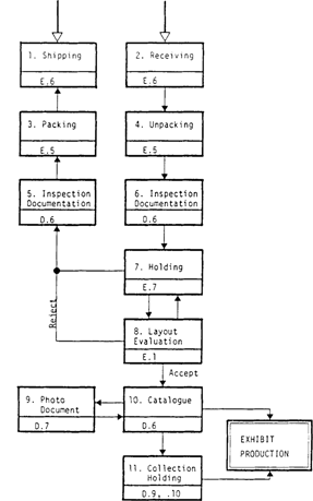
Figure No. 5.2: CANADIAN MUSEUM OF CONTEMPORARY PHOTOGRAPHY ARCHITECTURAL PROGRAMME
C. Exhibit Production
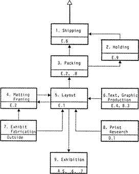
Figure No. 5.3: CANADIAN MUSEUM OF CONTEMPORARY PHOTOGRAPHY ARCHITECTURAL PROGRAMME
D. Travelling Exhibit Processing
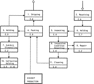
Figure No. 5.4: CANADIAN MUSEUM OF CONTEMPORARY PHOTOGRAPHY ARCHITECTURAL PROGRAMME
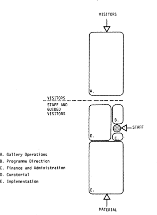
Figure No. 5.7: CANADIAN MUSEUM OF CONTEMPORARY PHOTOGRAPHY ARCHITECTURAL PROGRAMME