44th Annual Meeting – Research and Technical Studies, May 17, "Binders and pigments used in traditional Aboriginal bark paintings” by Narayan Khandekar

This was the last talk I saw at the meeting and was a perfect way to wrap things up, with a travelogue-slash-fascinating research project on the materials and techniques of Aboriginal paintings from the northern part of Australia. Narayan traveled to various art centers and museums to look at and sample pre-1960s paintings, talk to artists and gather local materials. He took about 200 samples from 50 paintings (including some from Harvard’s collection), the oldest from circa 1878. He also obtained materials from artists working today, some of whom took him around to gather materials from local sources, including the beaches of Bathurst Island (part of the Tiwi Islands off the coast of the Northern Territories – thanks Google Maps!). Back at Harvard, he and his colleagues (co authors were Katherine Eremin, Daniel P. Kirby & Georgina Rayner) gathered information on pigments, binders and other materials present that may indicate previous treatments. Narayan pointed out that only two samples of similar paintings had been analyzed and published before, such that this study presents entirely new information.

Australia map

Of particular interest was the investigation into possible binders. Oral histories and documentary evidence recorded various possible binders, including turtle eggs and orchid mucilage, but it was generally thought that paintings made before the arrival of missionaries in the 1920s didn’t have binders at all (a similar question has been on my mind regarding the paintings made in the Sepik River region of Papua New Guinea). Binders were present in 77% of the samples analyzed. No proteins, waxes, fats or blood were detected. The analysis of the oldest paintings did reveal the presence of orchid juice, confirming that binders were in use that early. The techniques of using orchid mucilage could vary; the sticky juice could be mixed with the pigment, or laid down first before applying the pigments mixed in water.
As expected the pigments were largely ochres, and Narayan noted that the trace elements present in the samples provide a fingerprint that can in theory be used to begin to trace the occurrence of different ochres in different areas, but that more study and sampling is necessary to pursue this.

Colorful ochres on the beach

Other interesting findings included the use of dry cell batteries as a source for black manganese and zinc pigments on paintings from Groote Eylandt (yes a very great big island off the east coast of the Northern Territories); this area also shows the use of natural manganese-rich ores and charcoal for black pigments. A curious silver oil-resin paint on two paintings from the 1920s turned out to correlate with the roof repainting of a nearby lighthouse at the same time. The presence of DMP (dimethyl phthalate) in some paintings prior to 1957 resulted from the liberal use of insect repellent (FYI this is the main ingredient in Avon’s Skin-so-Soft; it fell out of use when DEET was invented). The presence of nitrocellulose on Groote Eylandt paintings was connected to records from the 1948 expedition suggesting that they had been consolidated with Duco.
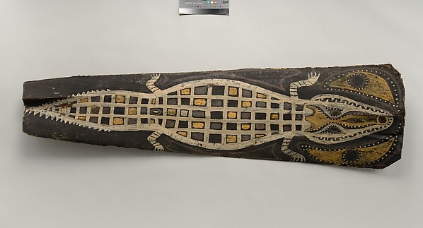
As always, research continues, and Narayan mentioned that they would be looking further into the use of gums and of bloodwood, though I didn’t get down any details on that (I hadn’t actually planned to blog the talk, so apologies for any lacunae!). Also, I’m pretty sure there was a crocodile sighting mentioned, but that too didn’t make it into my notes, so here’s one of my favorites for good measure…
43rd Annual Meeting-Book and Paper Session, May 15, 2015, "16-17th Century Italian Chiaroscuro Woodcuts: Instrumental Analysis, Degradation and Conservation" by Linda Stiber Morenus, Charlotte Eng, Naoko Takahatake, and Diana Rambaldi

The presenter, Linda Stiber Morenus, began her discussion of these complex prints with a description of the printing process. Chiaroscuro woodcuts were intended to emulate chiaroscuro drawings, which were comprised of black chalk shadows and white chalk highlights on colored paper. Color oil-based printing inks were first used to print 14th-century textiles, being used on paper by the mid 15th-century. The chiaroscuro woodblock prints required two to five separate woodblocks, inked with different shades lighter and darker than the midtone colored paper.
In order to better characterize the media, Morenus collaborated with art historian Takahata, and conservation scientists Eng and Rimbaldi from the Los Angeles County Museum of Art (LACMA). In addition to prints at LACMA, the team studied prints from the British Museum and Library of Congress. Out of over 2000 surveyed woodcuts, 72 were studied in depth, with X-ray Fluorescence (XRF), Fiber Optic Reflectance Spectroscopy (FORS), and Raman spectroscopy. Inorganic compounds were indicated by XRF analysis. FORS was especially helpful for detection of indigo. Raman spectroscopy provided additional information about organic colorants.
Renaissance artists’ manuals, such as Cennino Cennini’s Libro dell’Arte guided the research by providing information on the most likely colorants for printing inks. Inorganic pigments included lamp black, lead white, ochres, vermillion, verdigris, and orpiment. Organic pigments included indigo and a variety of lake pigments.
After providing background information, the presenter began to focus on deterioration and conservation of the chiaroscuro prints. The prints from the Niccolo Vicentino workshop had a high lead content. The inks typically had a low vehicle-to-pigment ratio, tending to turn gray around the edges, due to the presence of lead sulphide. Verdigris corrosion was also a common problem, as found on “Christ Healing the Paralytic Man” by Giuseppe Niccolo Vicentino, as well as 13 other prints from the same workshop. Typical copper-induced paper degradation included yellow-brown halos around inked areas and cracks in the paper.
Fading and discoloration were major problems for the organic colorants, such as indigo and the yellow lakes. Morenus compared copies of Ugo da Carpi’s “Sybil Reading a Book” in the British Museum and the Library of Congress, finding clear evidence that the indigo in the British copy had faded. The British Museum had confirmed the presence of indigo through Raman spectroscopy. At least 8 of the prints were found through XRF to have high levels of calcium in the same areas where indigo had been identified, suggesting the presence of chalk-based lakes. Organic greens had shifted to blue or brown where organic yellows had faded or become discolored.
The presenter concluded with suggestions and caveats for conservation treatment. First, she advised conservators to exercise caution in aqueous treatment, in order the preserve the topography of the prints. The woodblock creates a relief impression in the paper, and the layering of the inks adds another level of texture that might be altered by humidification, flattening, washing, or lining treatments. The low binder content also makes the inks more vulnerable to saponification and loss during alkaline water washing. Morenus warned that the hydrogen peroxide color reversion treatment for darkened lead white would be particularly risky, because the white lead sulphate end product has a lower refractive index than basic lead carbonate original pigment. This means that treated lead white becomes more translucent, and the lower “hiding power” shifts the tonal balance of the print to appear darker overall.
For exhibit recommendations, Morenus suggested that we should always expect to find fugitive organic colorants in chiaroscuro prints, so exhibit rotations should be planned accordingly. Maximum exhibit conditions should be 5 foot-candles (50 lux) of visible light for 12 weeks of exposure, no more often than every three years. She also indicated that overmatting should be avoided to reduce the risk of differential discoloration.
During the Question and Answer period, Morenus clarified the color order used in printing. Some prints were inked from dark to light, but most were printed with the lightest color first.
I thoroughly enjoyed learning about these beautiful prints, but I think that the discussion of the lead white conversion treatment-induced refractive index shift was the most important “take-away” from the presentation.